UX Research
Electrolux
User's Scenario and Needs
With the goal of evolving the sales channel in a sustainable and user-centric way, the Electrolux e-commerce team outlined the following demands:
Evaluation with the technical team and brand users of the product page interface on specific components such as: CTA color, relevance and organization of content and application of possible discoveries during the process.
Design Process
1 - Discovery
Application of techniques: Benchmarking, Usability Testing and heat map analysis. In order to understand the needs and difficulties of users.
2 - Ideation
Interpretation of data, generation of insights and identification of functionalities for the online store.
3 - Prototyping
Align the insights obtained from the research with the development of the graphical interface. Technological validation of functionalities with the development team.
4 - Developing
After customer approval, the coding stage and integration with the VTEX platform, as well as the application of the Q&A stage.
5 - A/B Test
To ensure that the interface change is assertive, the application of A/B testing between the pages was proposed.
BenchMarking
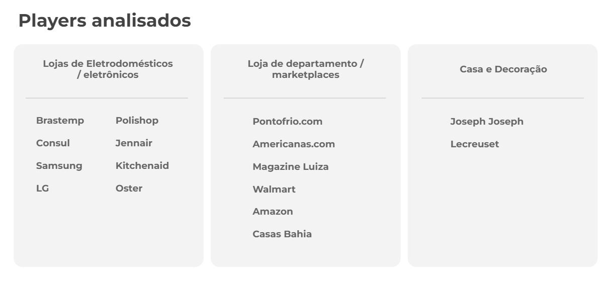
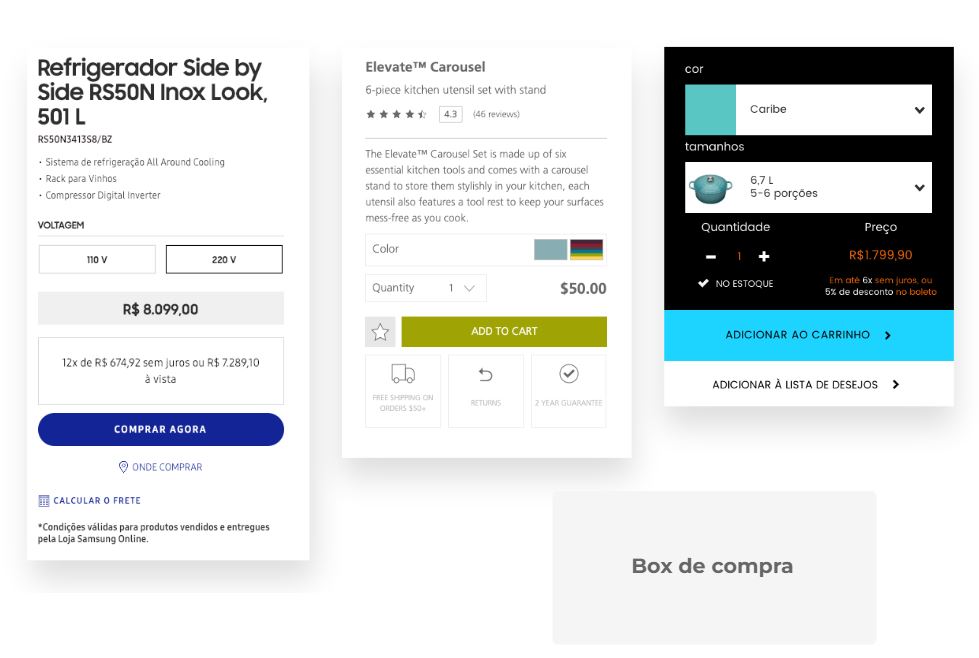
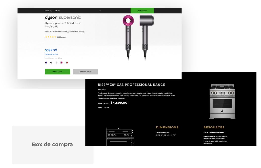
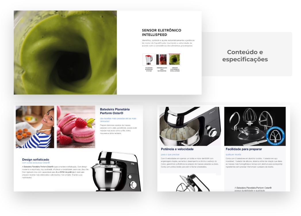
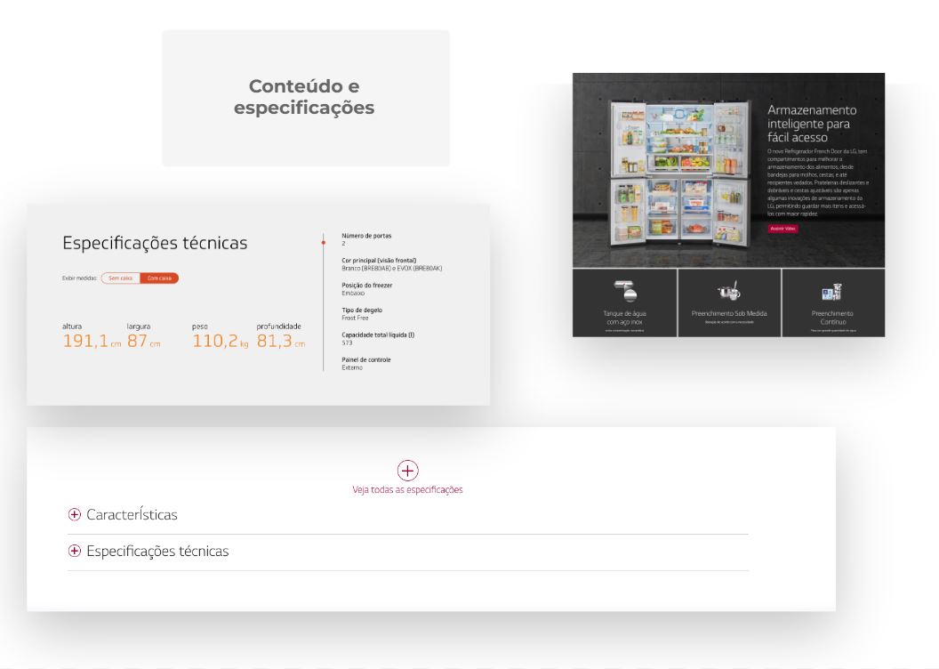
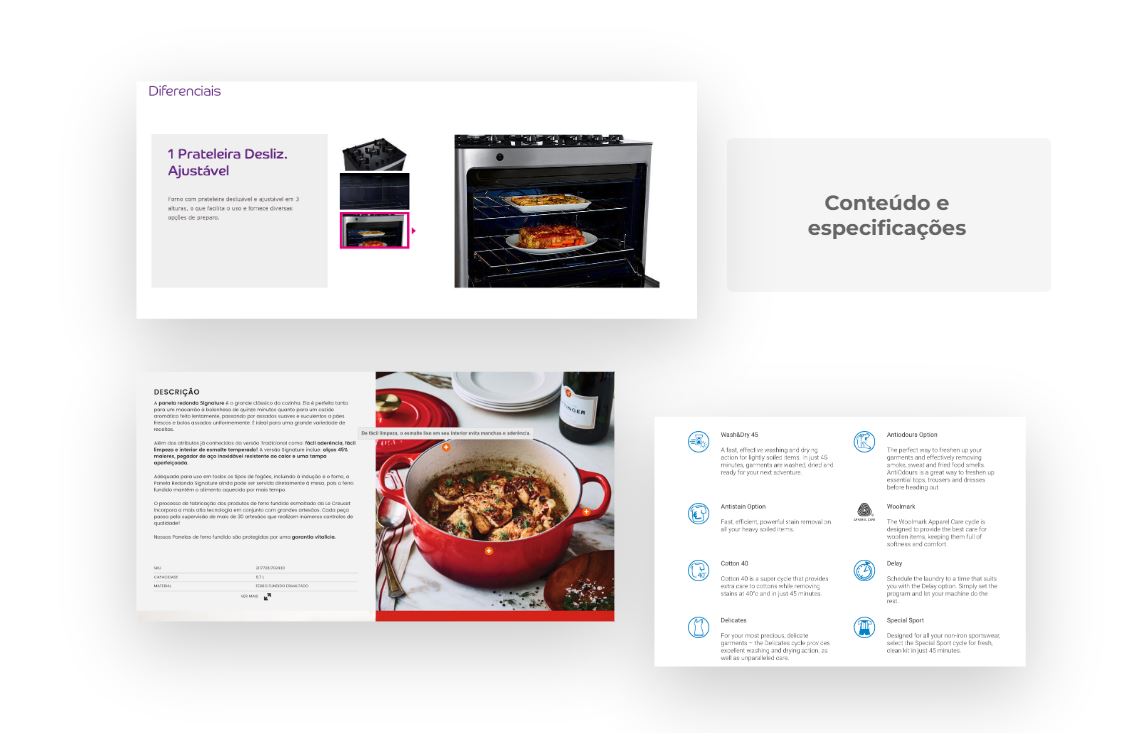
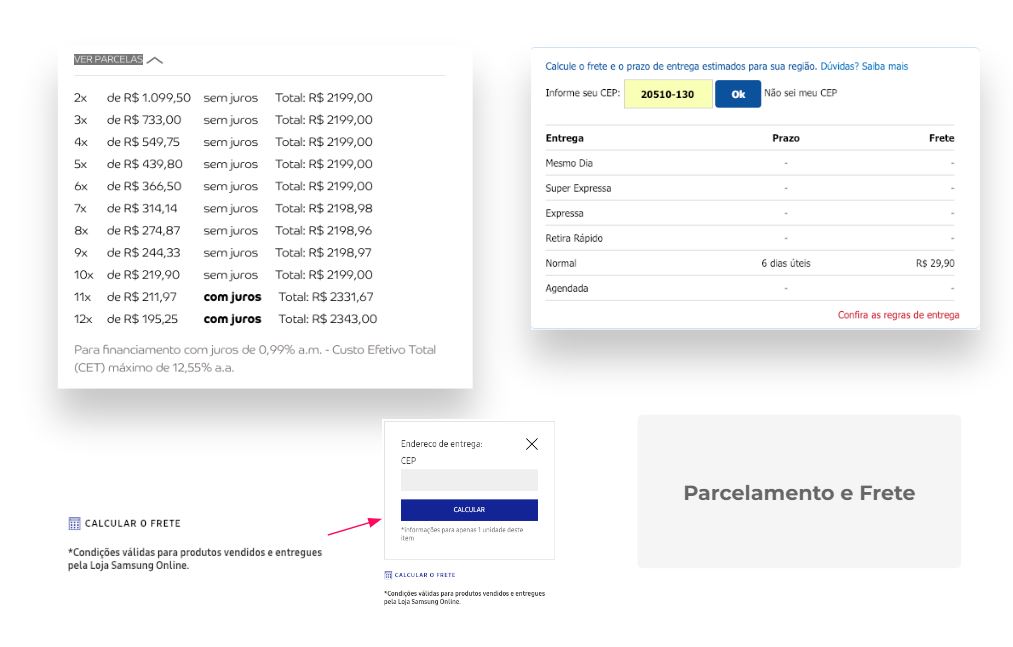
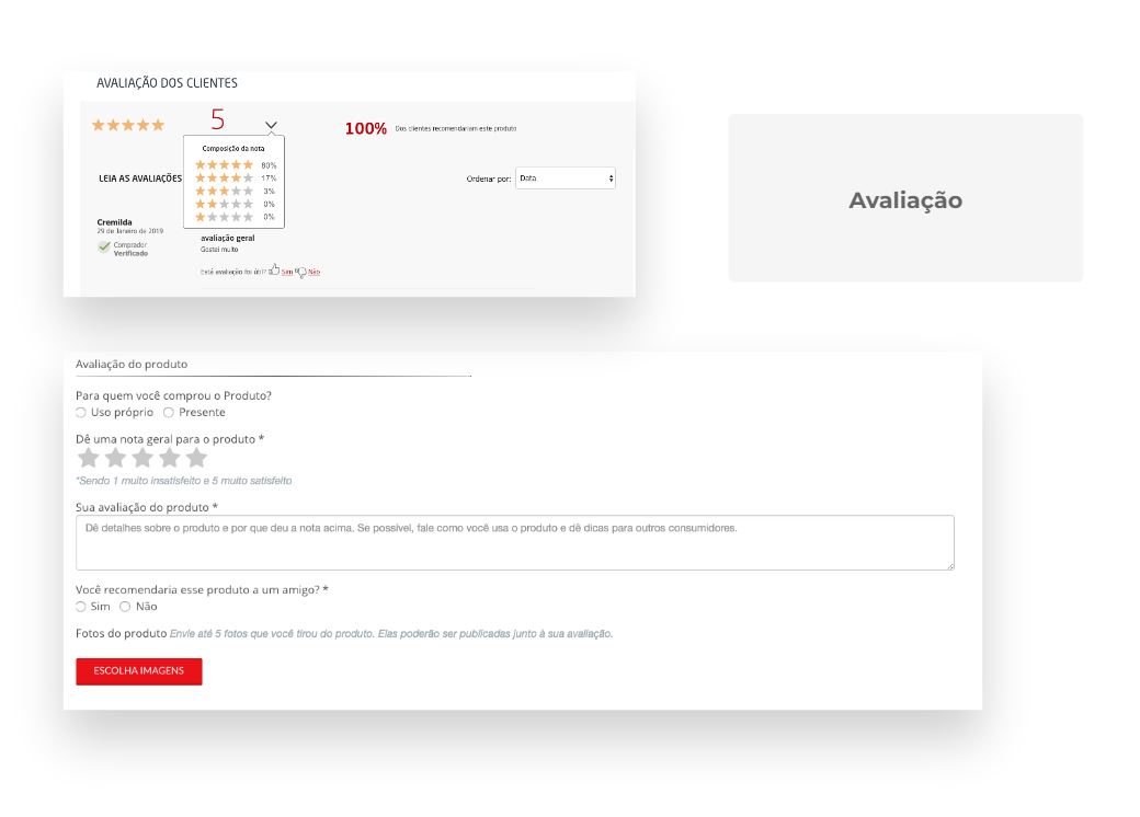
Interface analysis of the durable consumer goods market players, specifically on the product page. Categorized into: Purchase Box, Contents and Specifications, types of payment, shipping, and rating.
Usability Test
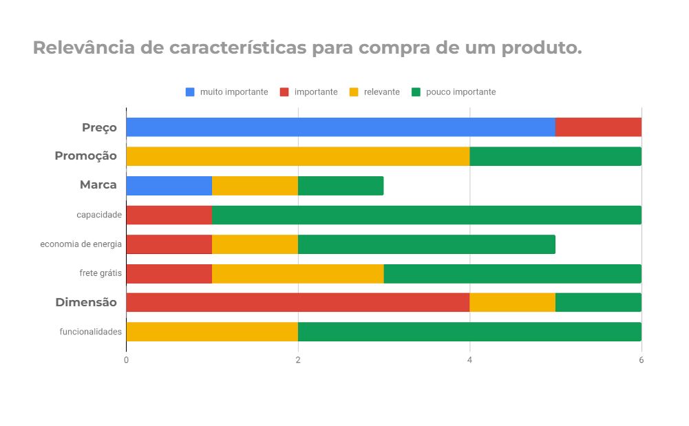
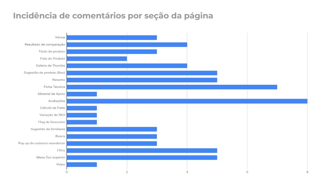
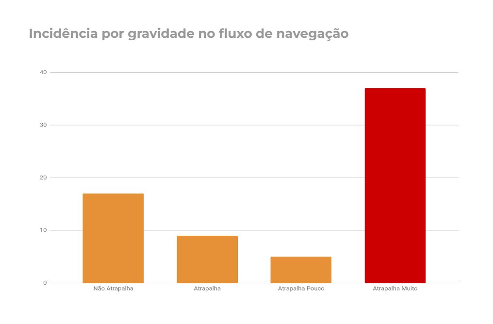
The Think-aloud Protocol technique consists of observing users performing specific tasks and actions within a specific environment. These actions are verbalized by the participants in real time and observed by a moderator, who records the actions taken by each participant.
User profile
4 women – 2 men
between 25 and 37 years old
Task
They were asked which product they are in demand at the moment and instructed to go to that product’s page on the Electrolux website.
Afterwards, they were stimulated to report the decision-making process for purchasing the product.
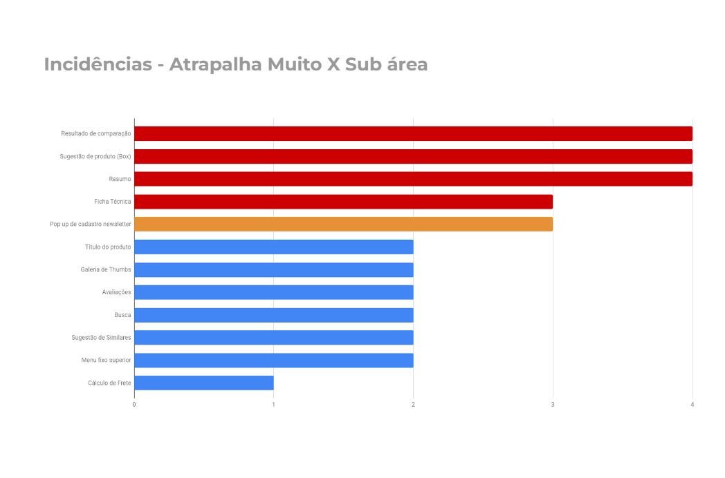
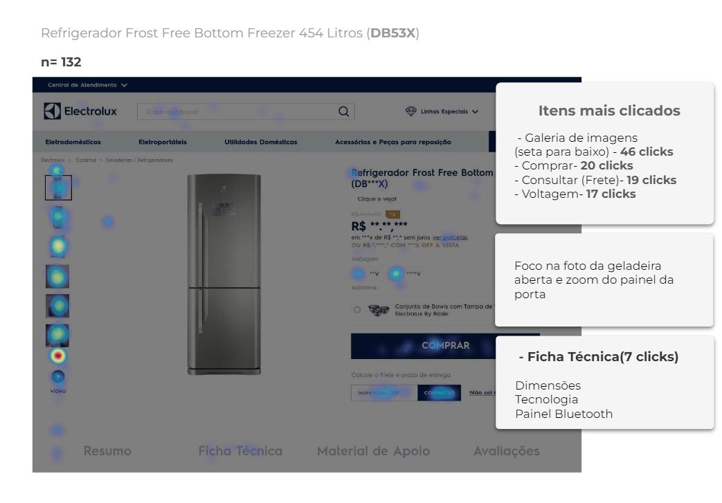
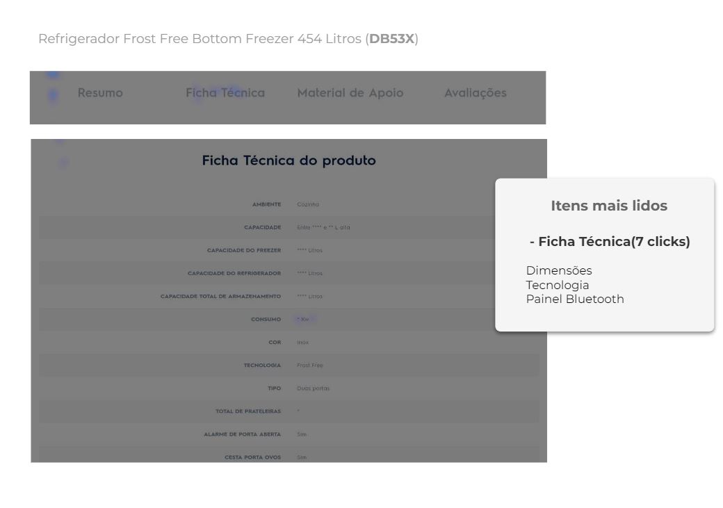
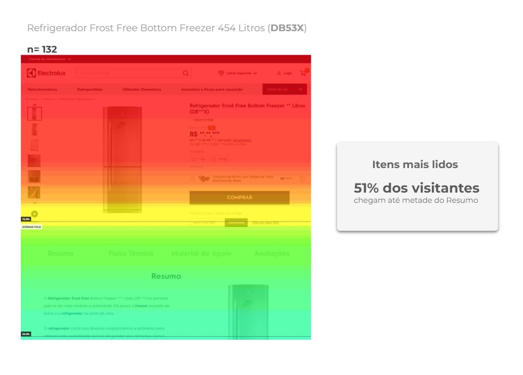
Heat Map Analisys
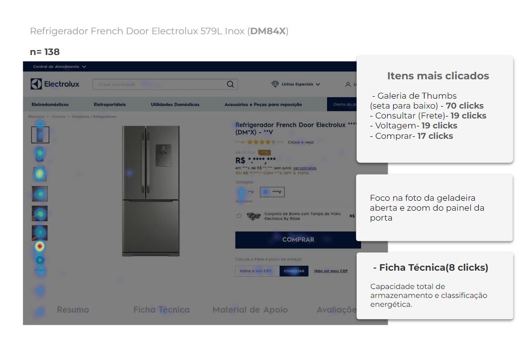
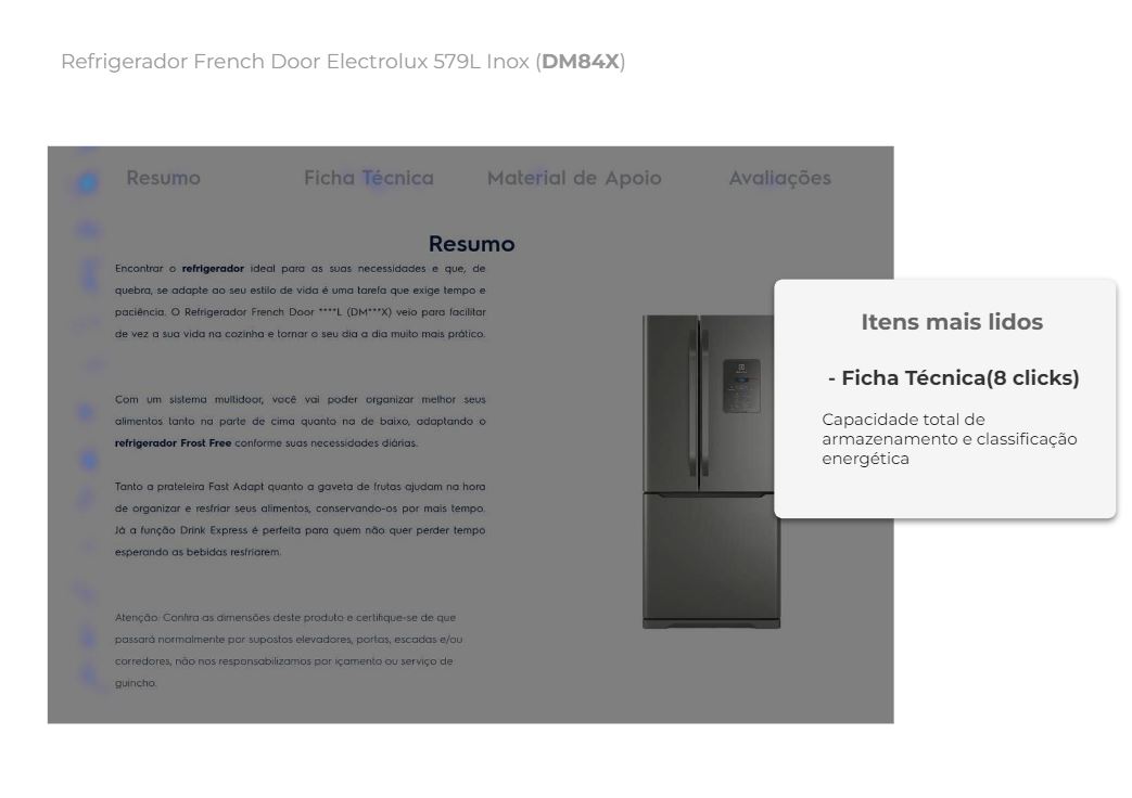
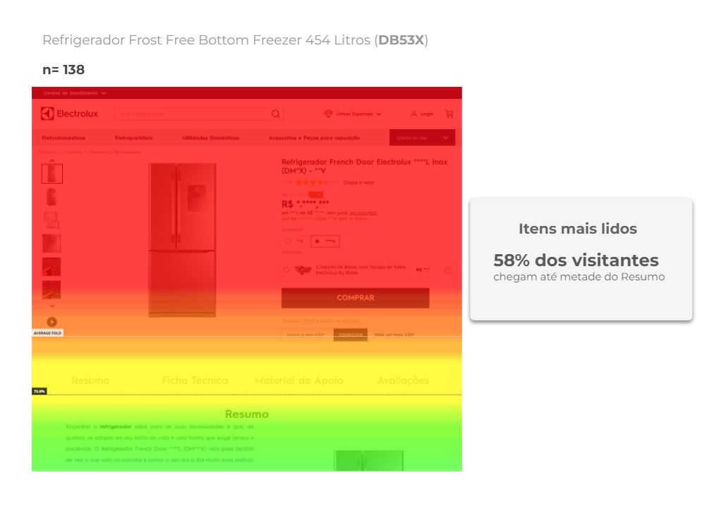
Painpoints // Problem Statement
User is unable to compare products
Product information and available features are not clear to the user
The suggestion of similar and complementary products (cross-selling and up-selling) is not clear and is not relevant for the user.
Relevant information is not readily accessible
User demands suggestions for other similar products
Sticky menu on top of desktop device is irrelevant to user
Users did not notice the offer of similar products on the page.
Project duration
5
Weeks
16
Screens
Tools used
Value Proposition and Recommendation
Product page input flow redesign
Product page's Image gallery redesign
Product Storytelling organization in the image gallery
Evidence of the most relevant product information
Redesign of the Technical information area
Comparison area design with similar products
Similar products suggestion design with user-relevant filters
High Fidelity Prototype

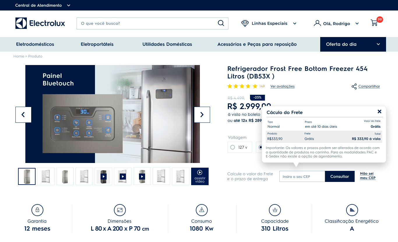

Results
Main image galery click rate increase 34%
Page Scroll increase 28%
Conversion rate increase 21%
Have you seen these?
Venancio Drugstore
Discovery / Card Sorting / Heuristic Evaluation / Usability Test
Dexco
Discovery / Usability Test
Fornada App
App Design Process